Speculation about a link from virus DNA to severity of disease and why some people are saying it is two viruses.
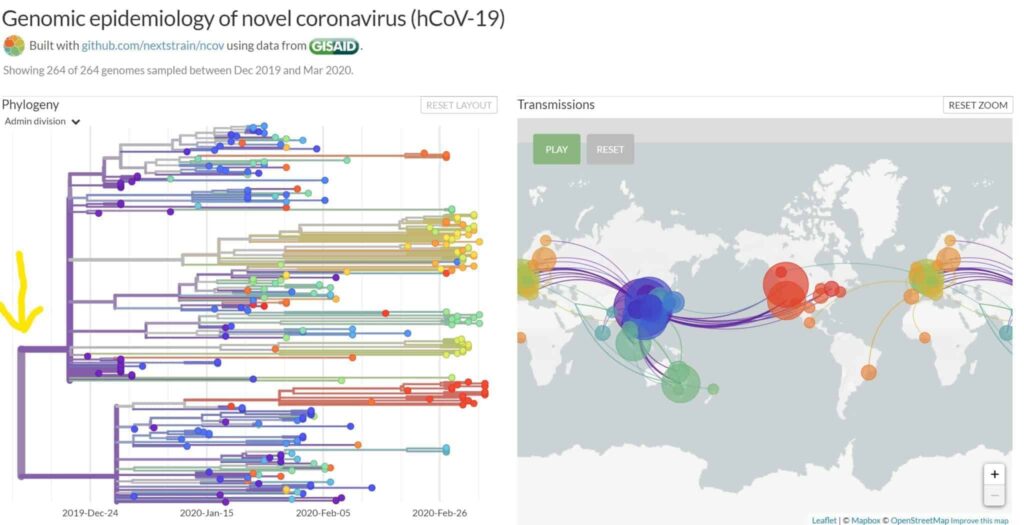
This chart from the Fred Hutch in Seattle is interesting. On the left it shows all 264 cases in which the entire 30,000 letters of the virus DNA have been read. When they were read, between the end of Dec and now, goes left to right on the bottom scale. Each branch is where one of the 30,000 letters has changed, giving the virus new, usually unpredictable properties. The map on the right is color coded to let you match where in the world the virus is when it made its DNA spelling errors. The bigger the colored circle on the map the more cases in that location.
I put a yellow hand written vertical arrow at about Christmas time when, still in China, the virus made a ‘trunk’ split; a single letter DNA mistake…one letter out of 30,000. The infections then spread around the world, with the larger two-thirds coming from the top branch into Iran, Italy, and the rest of Europe and the smaller one-third bottom branch going to America and Australia. More mistakes continued to be made off of that first split as the subsequent splits indicate.
What’s interesting is the viruses in the top branch are in the parts of the world with patients with more/worse cases. This could mean the ‘Christmas DNA letter mistake’ has true clinical meaning.
I am going to watch to see if the virus in the top branch continues to be more aggressive than the one in the bottom. Matching DNA sequences and clinical outcomes is a speculative hypothesis at this point however.
Only time will tell.


